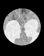
Today’s tutorial was incredibly brief, as everyone seems to be at a stage where they are fairly comfortable with the direction of the work, I mostly just explained to my peers what the work had me made so far and my concerns about the layout of my webpage.WHen I showed people the design I have so far the main response was the fact that it doesn’t look like webpage, it’s more similar to the representation of a book than anything you would find online. WHat needs to be addressed is the involvement of the text on the page, as that’s whats seperating my work apart from any other anthology out there. There could be ways in which the text was animated, brought to life and inclusive to all the animation.
What’s important to remember from this is the importance of it showcasing the medium rather than what my animating and web design skills. I need my designs not be limited to what my web designer can be achieved but be limited to my own animation and what can achieved by my own intuitive. For example even if I make an amazing plan of this all interactive beautifully animated page but It’s not possible to make I will still get credit for being intuitive enough to make and consider the page as a possibility, utilising the medium as best I can.
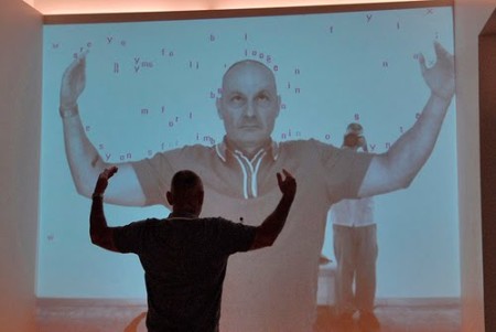
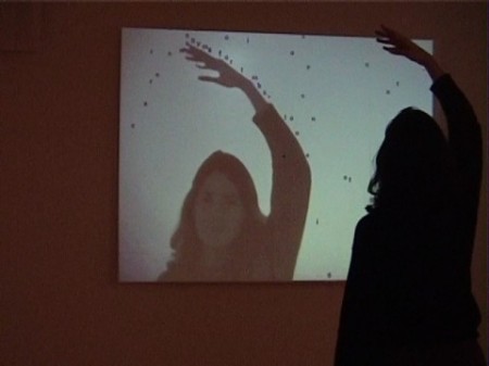
There is endless opportunities to work with the text in creative ways, for example there are ways to use text like the interactive project by Camille Utterback: ‘Text Rain’.
This project uses the involvement of text as a material matter, an integral part of the work, so even though my now doesn’t have to be interactive it can use inventive ways of working with text as an additional medium.
From now until my next tutorial I want to have a better design for my webpage, whilst still continuing to make GIF’s for this project.


