I have finally finished the animation and I am incredibly happy with the result! it was a huge learning curve and found the process a lot more time-consuming and problematic than I first assumed. however, I do think that it paid off. I had a few issues when filming it such as extra frames where they were not needed so around 8 I decided not to film at all in the end. In addition to this I couldn’t get the lighting to work as well as I did before so it was lighter before and ended up having a yellow tint. In addition to this there were some typo’s of ‘Facts’ and ‘collaboration’ which were pointed out, luckily the apostrophe was able to be edited out on after effects and then I was able to adjust the spelling on collaboration to just re-film those 8 frames and eventually slot them all together in the end. Despite these errors the final second half of the animation went very smoothly. All of these problems though were able to be edited out digitally after, so were not a huge concern. In addition to this it also ended up having a lot of changes from the storyboard which I think, in fact worked a lot better for the animation in the end and mad ethe whole thing move a lot more smoothly. All of these problems were annoying but I’m grateful as it taught me a lot more about the animation process and taught me how things are meant to be done.
Overall, this project has taught me a lot about my own practice and I work as a practitioner. i think As an illustrator I can be more diverse with my skills. Over this project I have learnt to use premier, after effects, dragon frame and a line tester. Looking at all of the animators I have also see how to use movement with shapes and imagery to objectively present a new idea whilst avoiding chliche imagery. All of this successfully taught me how to create a considered animation illuminating a piece of text through a range of different techniques including typography and the movement of symbolic shapes through expressive mark-making.
When I submitted this project I also had to submit a short entry to explain ‘My Big Idea’ which exactly summarises the project and what it meant to me:
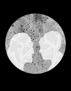
As an illustrator my first task was tackling an intuitive way of illuminating the quality of inquisitive thinking. I wanted it simple, understandable and not something intending on overshadowing Ian Leslies words. For me, the way to do this was simple line drawings with a collaboration of typography, shapes and familiar imagery that could appeal to any age, gender or intellectual ability. My research and inspiration included the animation of Charles and Ray Eames which uses clever links of familiar imagery and shapes to relay an understanding of the audio. The typographic illustration of Marian Bantjes also inspired me to consider the importance of text and the understanding of text as imagery for comprehensive purposes. This was my first try at animation and comprises of individually inked frames, which was a huge task but the unpredictable nature of ink delivers a sense of charm to the illustrations which I really loved. I experimented with different methods but the simple white background and strong black lines kept a clear response to the audio without over cluttering, providing just enough information to enlighten the audience of the metaphors spoken by Leslie. My imagery was focused on the idea of not using the obvious answer but instead searching for an original and alternative way of drawing the metaphors and descriptive language
